When it comes to Content Management Systems, there are plenty of fantastic options to choose from. You've got WordPress, an easy to use system meant for blogging that be used as a framework for all sites of great sites. Drupal, the easily extendable script for sites not quite possible in WordPress. And Joomla, a system which is only debatable in quality but is at least useable as a CMS. Moodle on the other hand, is pretty much the perfect example of a CMS gone horribly wrong.
Or to be more precise, it's a Learning Management System (think, CMS for schools) that's gone horribly wrong in the design stages and is generally an absolute pain in the ass to use. So what's so bad about this abomination against good software design? What makes it such a nightmare to use? Let's find out!
Installation
So let's start with the install process. Downloading it for the first time, you'll immediately notice one alarming thing about the package that should set those alarm bells ringing... the ridiculous file size.
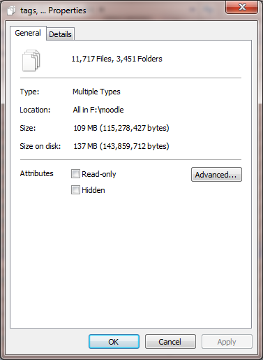
Moodle, is over FORTY MEGABYTES IN SIZE. As a ZIP file. And when you extract this, the total size of the package is over ONE HUNDRED MEGABYTES in size. This is really bad news when you consider that XenForo in all its glory is only 20 MB, WordPress is much the same and most other scripts are generally at least below 50MB overall. What uses this space you may ask? Two bajillion useless features that don't work right, stack up poorly against standalone competitors and make even the worst learning keen students and teachers on the planet want to reconsider their life off the bat.
And every time you need to upgrade, you have to download this huge zip folder filled with the same darn files. That's like, 5 minutes taken just to extract the damn thing whenever an upgrade is released, and another hour or so to upload everything! No wonder these schools hire 'professional' administrators to handle it!

Above: This is the very definition of bloatware.
Oh, and file number? 15,169 files in total are included in the download. Given that the likes of Hostgator and Bluehost (and many other shared hosts) limit max inodes/files per account to 50 000 max, that's literally about a third of your max files gone the minute you upload a vanilla install of this thing. That's just nuts considering how (relatively) fewer files every other script I've ever seen uses.
But let's say you've gone through that pain of file uploading and setting up your database in CPanel. It can't get any worse now, right?
Well, wrong. Cue the ginormous install page.
Yeah, I can't remember this exactly, but it was pretty much something that made your average cell phone providers terms of service look short by comparison. Heck, I think the contracts your average bank gets you to agree to make Moodle's installation form look short by comparison. It's that ridiculously long.
Still, it's easy enough to install eventually. Heck, even I did it, and I'm not exactly good enough that I'd put myself forward as a college IT admin.
Performance
After the install, another issue here seems to be performance. True, I've had no direct experience of how a busy install handles (the one install I had was a test to see if I could match my old university on a tech level by setting up the same script for a few friends), but according to the requirements page... it's not pretty.
From their own site:
Memory: 256MB (min), 1GB or more is strongly recommended. The general rule of thumb is that Moodle can support 10 to 20 concurrent users for every 1GB of RAM

Above: Ridiculous requirements much? It's an open source script, you shouldn't need this much space and server resources...
So for a site about as active as one of my current ones, I'd need a server with about 10-20 GB of RAM. Which according to someone like Rackspace, would probably mean paying over 1000 dollars a MONTH on hosting. For a site that could be handled by a decent script (like the ones I currently run) on shared hosting for about a fiver a month. Sheesh. This thing could make vBulletin 5 look impressive on a server resource usage level!
Add a 'realistic minimum' disc space of 5GB (according to the site), and you've got a script which apparently can't even realistically be run on a low end shared host and requires a beefy dedicated server for a fairly active site.
Style
Stylistically, Moodle is a bit better than it used to be. Well, it doesn't have the awful as sin smiley face avatars it had a few years back and the colour scheme has at least been toned down a little. But it's still outdated looking beyond belief.

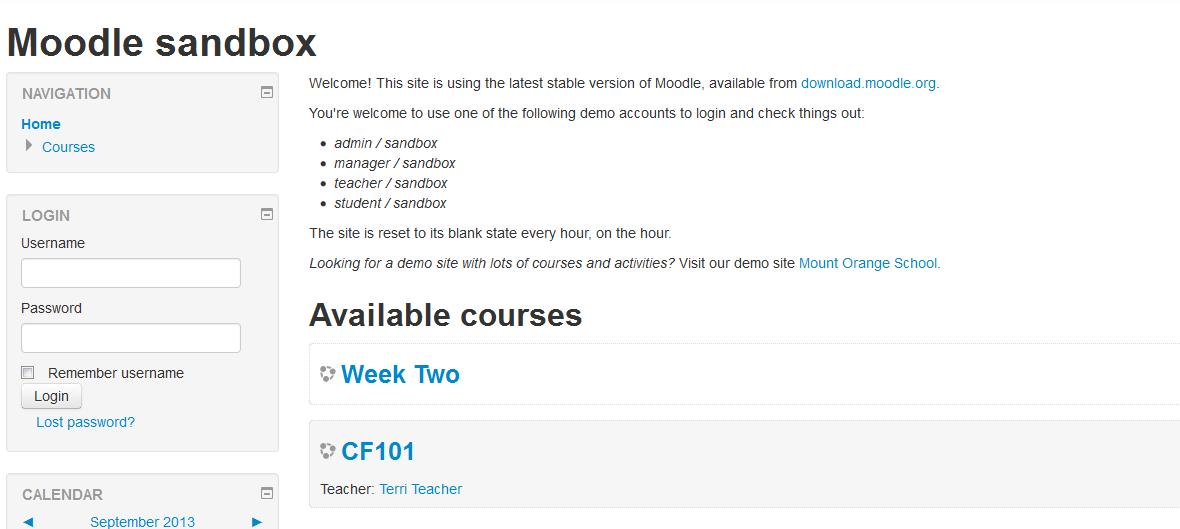
Just look at that demo. Seriously, it looks like the unholy combination of an unmodified WordPress theme and vBulletin 5. Or what Internet Brands would design if they were in the education business. It's unappealing, it's bland, and it honestly looks like someone turned off CSS styling in general in their browser window.

Above: On the bright side, they got rid of this 'charming' default avatar fellow.
So by default, Moodle is designed very poorly. It's got a default theme that's not fit for purpose, and from what I hear, isn't particularly easy to customise either. Not good.
Features
When it comes to features, the Moodle makers had one simple philosophy; here's everything and the kitchen sink, let's toss it all in without considering how many people would actually use most of it. Unfortunately, they also hit the other issue encountered by feature bloat; none of these features being fleshed out or well developed at all.
Or in other words, Jack of all trades, master of none. That's probably the best explanation here.
To put it bluntly, every single feature here just kind of sucks. It has forums, but they're so bland and so lifeless than even your students are likely to avoid posting on them. It has wikis, blogs and chat, but all of them are so basic and so 90s in style that they seriously make the vBulletin suite add ons look like a masterpiece of software design by comparison.
How bad are these things? Let me explain...
For starters, the forums are way, way below even what the likes of Drupal or Joomla offer with their built in forum apps, let alone anything standalone or remotely well developed. Signatures? Nope. Quote? No. Any form of like system, social media sharing or anything else that could bring interest? No there too, the whole system looks sparse to the point of looking deserted.

Above: And you thought vB 5 looked bad...
And the blogs are no better. No interesting styling, no categories or tags or anything else. Just a list of entries for each blog with practically zero user customisation options. Poor.

Above: They called this sort of thing a wiki...
But it doesn't end there. Not only are the features poor, but some (see, the blogs) offer a bit too much power to the user...
Namely that they don't strip out unnecessary HTML or CS No, there's no BB code system here, all advanced stuff appears to be done directly in HTML with the bare minimum of filtering. So you can literally break the blogs in any way you feel like by simply messing around with advanced coding and never have it edited out. It gets even worse if you're promoted to a 'teacher' role, since they get to set up HTML blocks which aren't even filtered for Javascript, flash or iframes. Hope your school has a high level of staff satisfaction!
The whole system is a great example of the old adage of 'stick to one thing and do it well', or more precisely how to completely fail in this respect. Features seem to be added based on some vague 'idea' of whether the users would ever need them (for most schools/colleges/communities, the answer is probably no), yet none of them are done particularly well. There are also glaring usability problems, with simple terms being renamed from those used in other programs or websites (indent is named 'move right' for instance), and a complete lack of any way to upload multiple files at once without using a zip file. It seems like the designers just completely fail to consider simple guidelines, or rules like 'users spend most of their time on other websites', leading to a badly designed script which can't measure up to just about anything else.
So all in all, what do I think of this software? It's a terribly designed script that's not fit for purpose, bloated beyond belief and is apparently made with the mentality that everyone's still living in the 90s. Indeed, it's so utterly hated among some people that when a new open source LMS system to replace it was announced, the reaction was basically 'ding dong the witch is dead' rather than any question about whether it was better than this thing. Heck, it's so damn awful that even vBulletin 5 looks like a masterpiece of software design and programming in comparison.
Don't bother with this thing. If you just need a CMS or anything else of the sort, stick to a well known script and just rebrand it for your educational site. And if you really do need an alternative system for a school setting, you should just set up XenForo or Invision Power Board and use that as your LMS. Much easier, much better coded and less likely to brutally murder the server under the sheer resource usage.
So that's my review of this awful elearning LMS system. What do you think of it?
